Layout
Consistency of layouts for different platforms strengthens Eesti Statistika’s brand, and using similar elements on all sites will decrease cognitive load.Generic website layout, database and dashboard share similar navigation and layout logic.
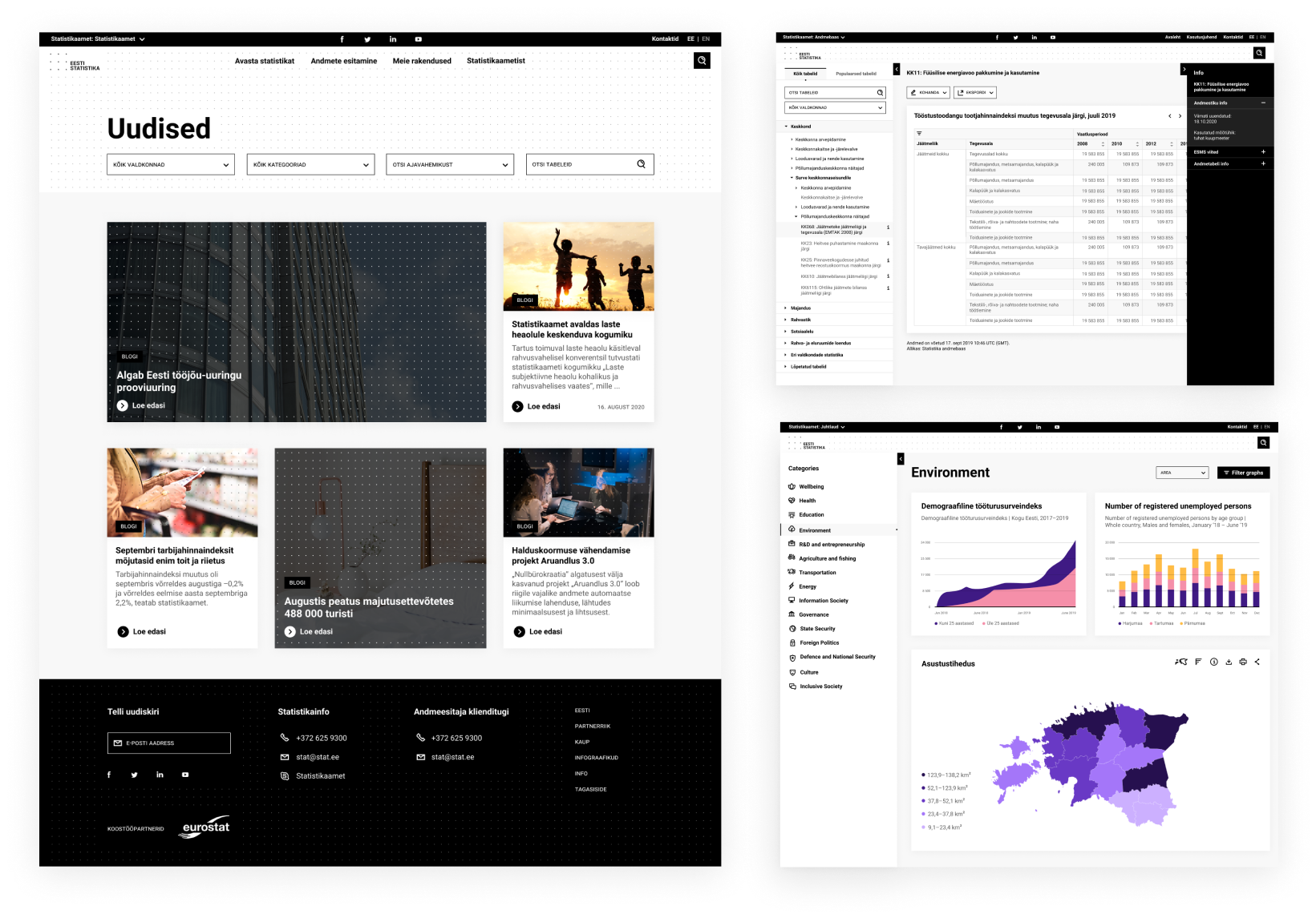
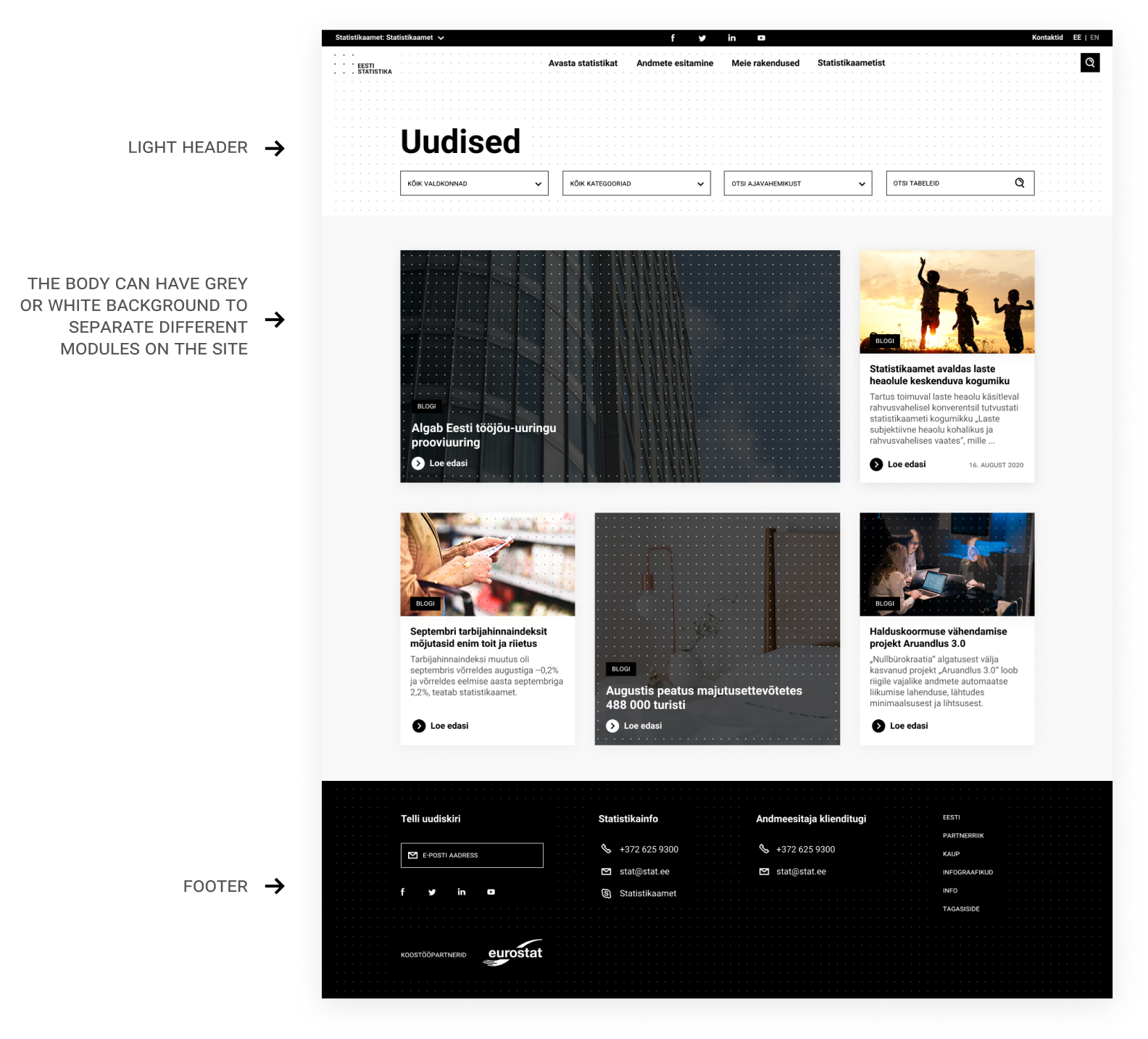
Generic content website example
Header and navigation
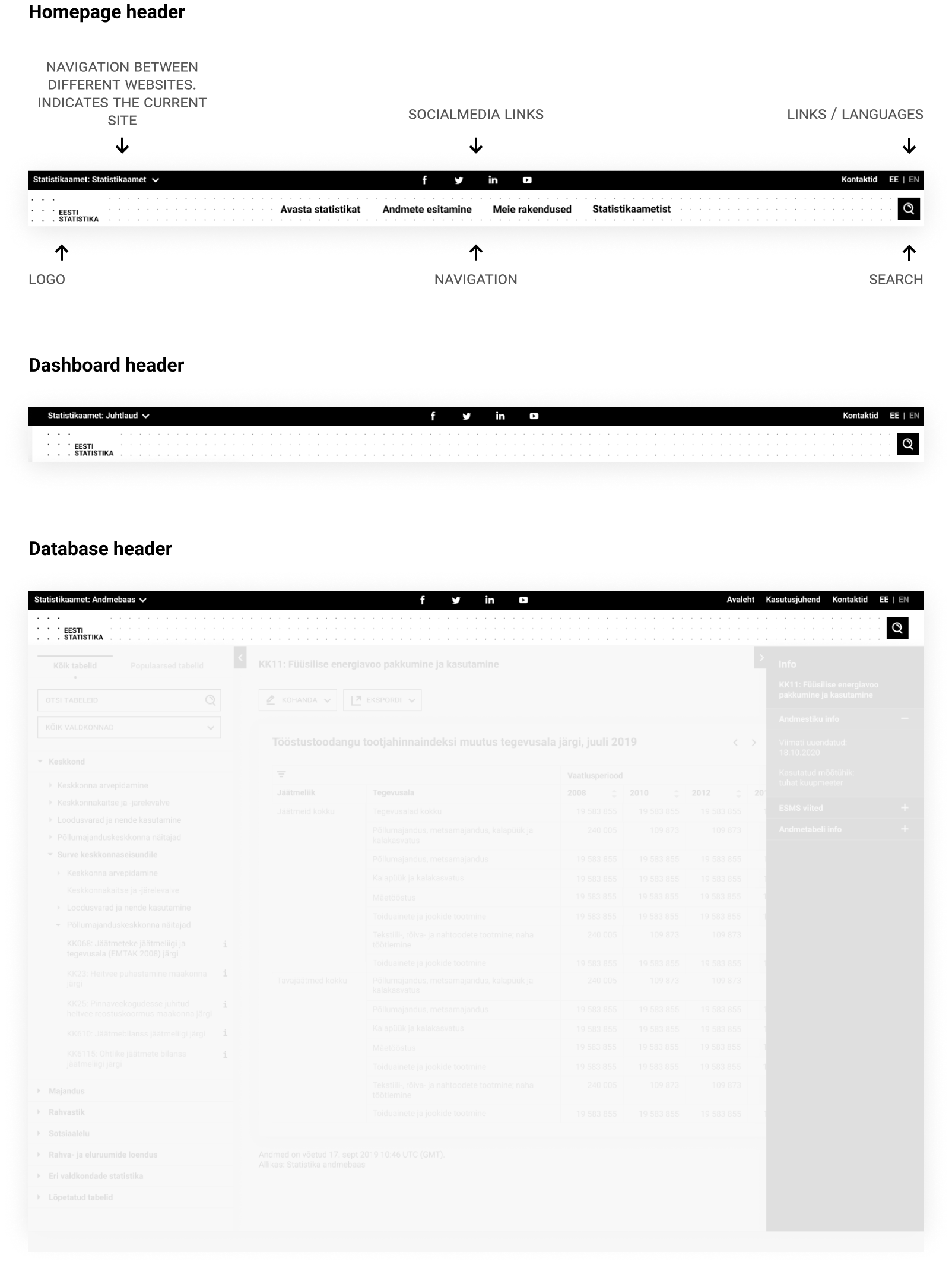
The header consists of two sections, meta header with black background and white header with a pattern background. The meta header is the same on all SA websites, helping the user navigate between different SA digital products and gather common info such as social media links, contacts and languages.
When scrolling, the header is not sticky, but it appears as users stop and scroll upwards.
Breadcrumbs

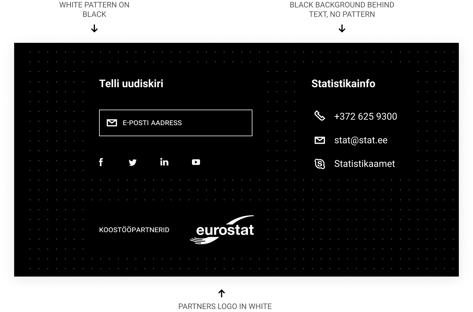
Footer
The web page footer, located at the bottom of each page, contains relevant information such as contacts or quick links to important actions and pages.

Dashboard/database
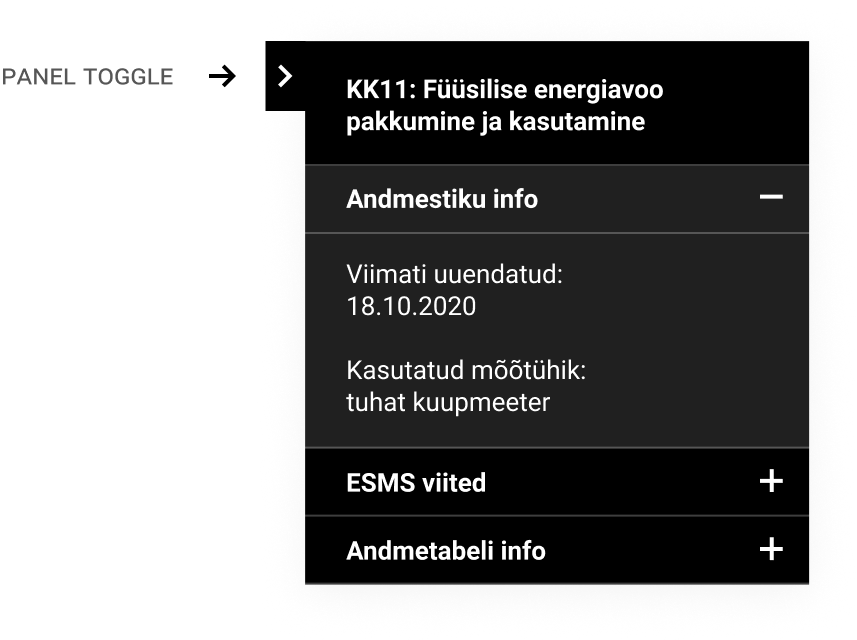
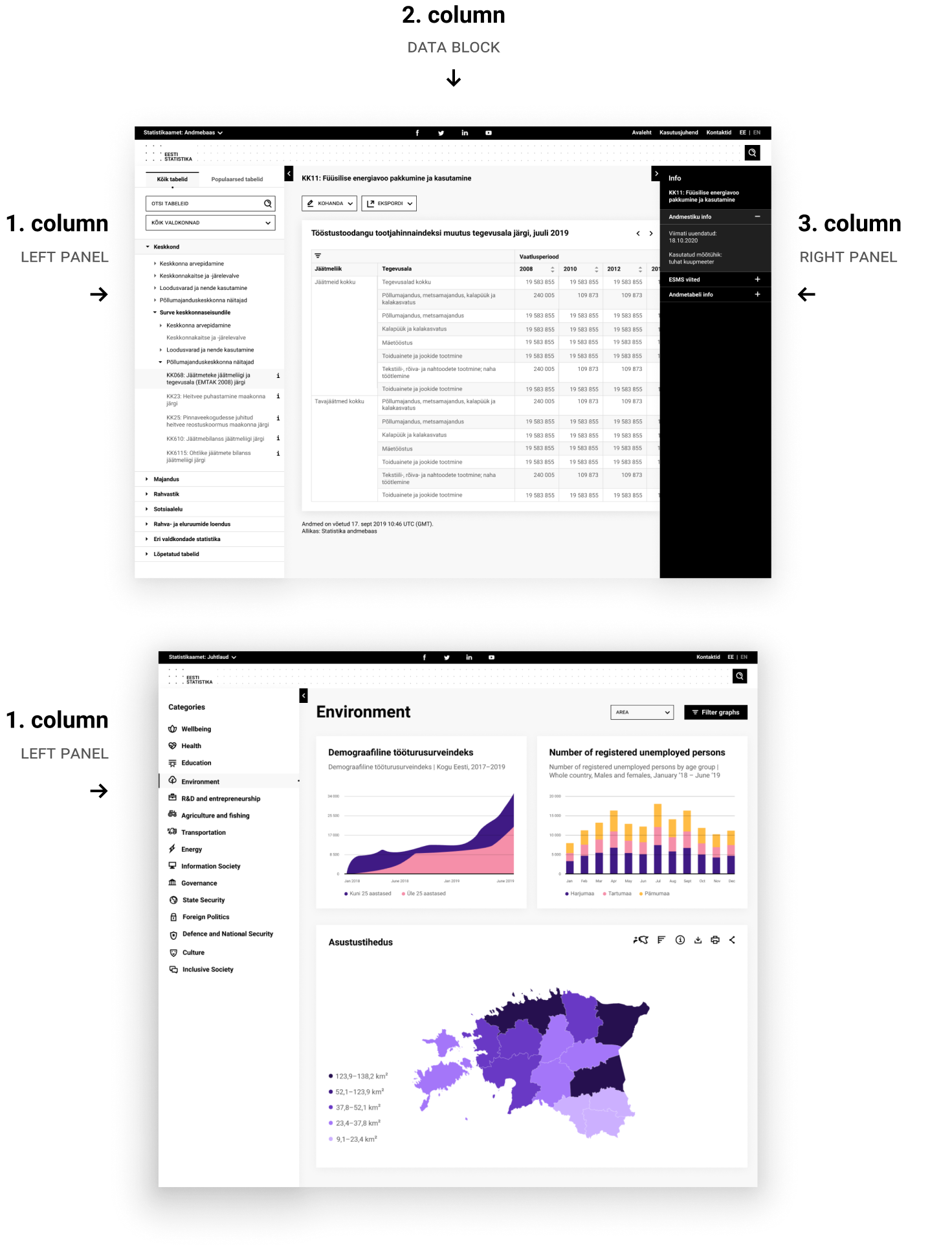
Complex user interfaces such as dashboards and databases are holding a lot of info, raising the need for a well-structured layout. Panels are useful elements providing extended room for information, and can be hidden with a toggle button.
Left panel
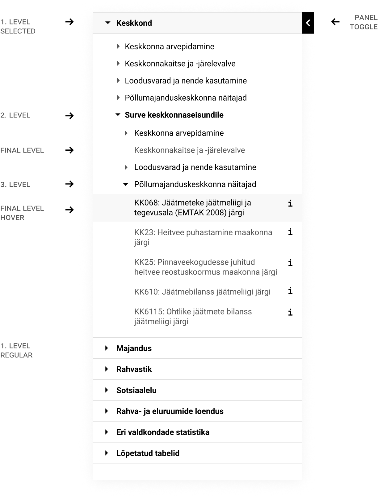
Left panels should hold navigation information.
Right panel
The right panel should hold meta details or extra information. The black background helps distinguish information from the overall light website.
