Buttons and links
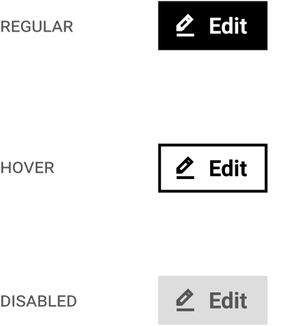
Buttons and links allow visitors to take actions and navigate the interface. Buttons can be differentiated between low to high priority actions.
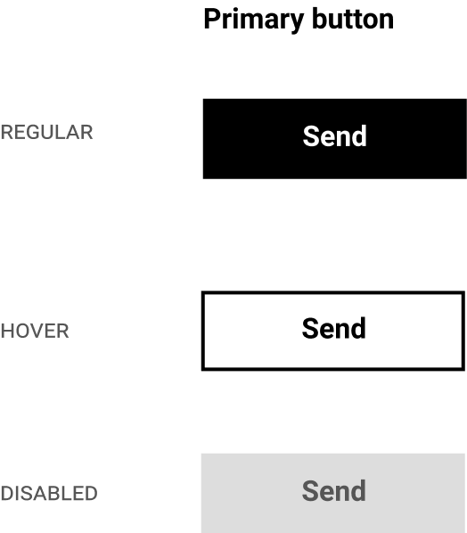
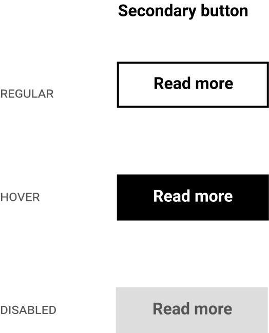
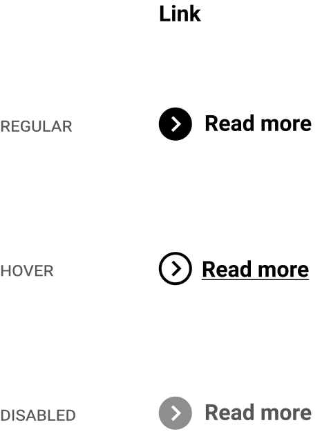
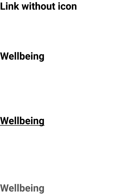
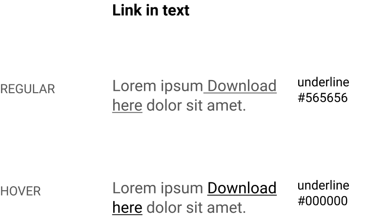
Each layout should have one primary action. In this way, it is easier to notice the different actions available, and to prioritise or set a hierarchy. The primary button should be used for actions such as “Send”, “Contact”, “Save”, whereas links should be for navigational purposes such as “Read more”.
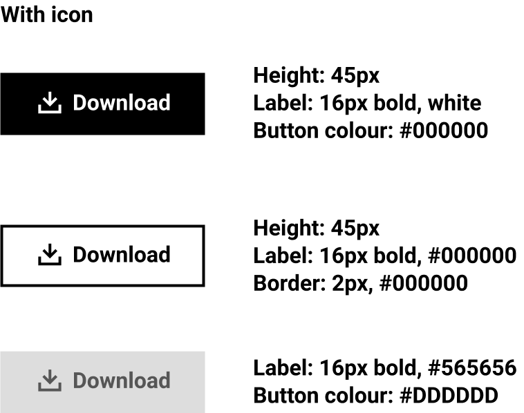
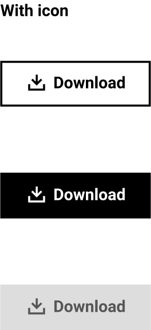
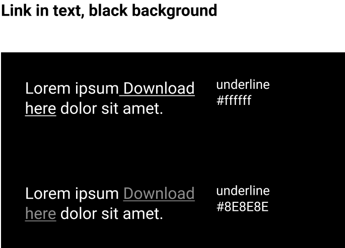
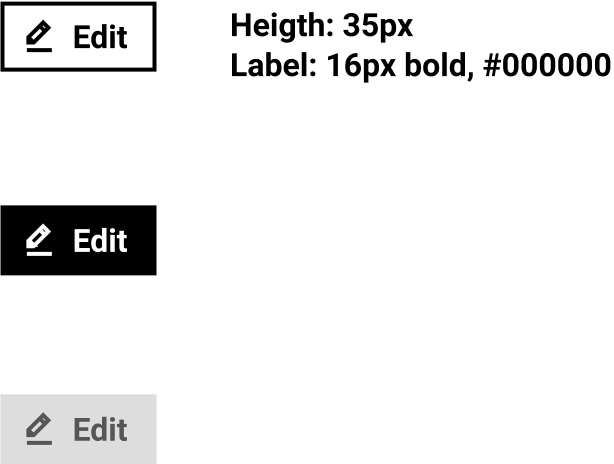
Button label and link have the same text style: Roboto bold, 16px
Small button
The button takes the width of the text in it.
Primary
Secondary
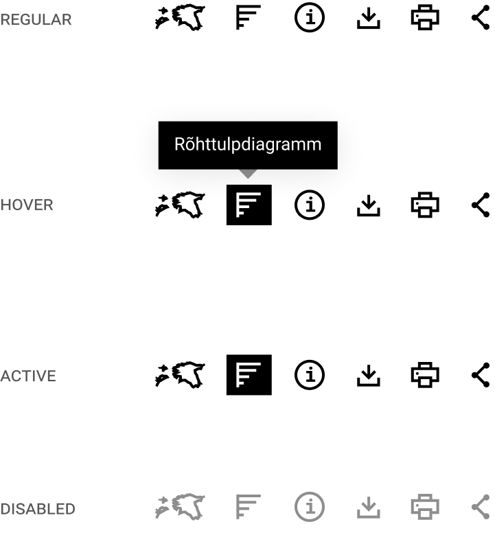
Icon buttons