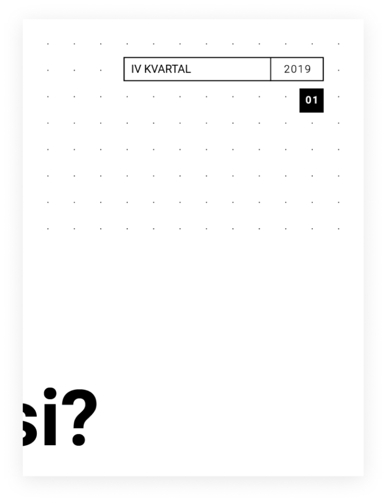
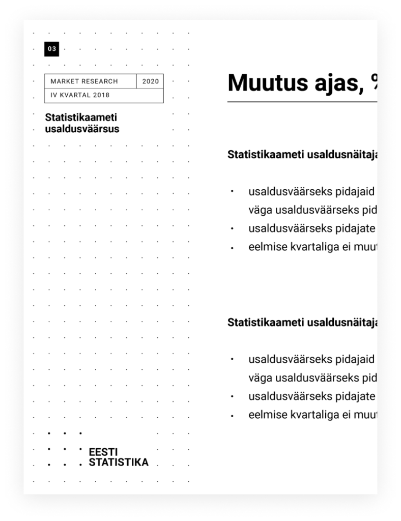
Layout
Consistent placement of image, text and graphical elements ensures a cohesive brand identity. When creating materials, use grids to organize information and define position, space and text size to establish a hierarchy. Margins enable a readable experience in information-dense materials.
Use following elements to create a layout:
- pattern
- logo
- header
- title
- visuals: images, graphics
- text content
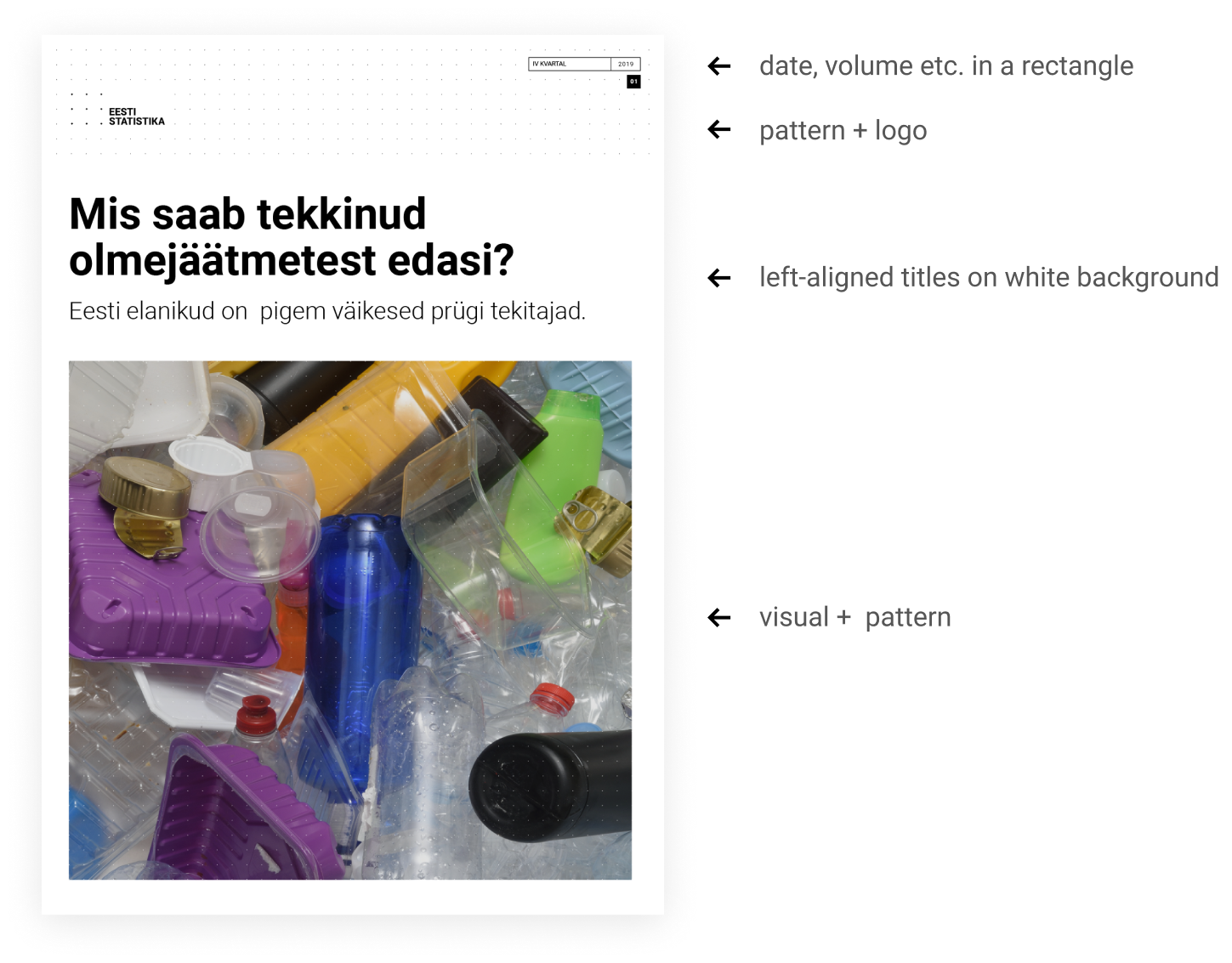
The pattern with the logo is used as a branding element on backrgound or on one edge.
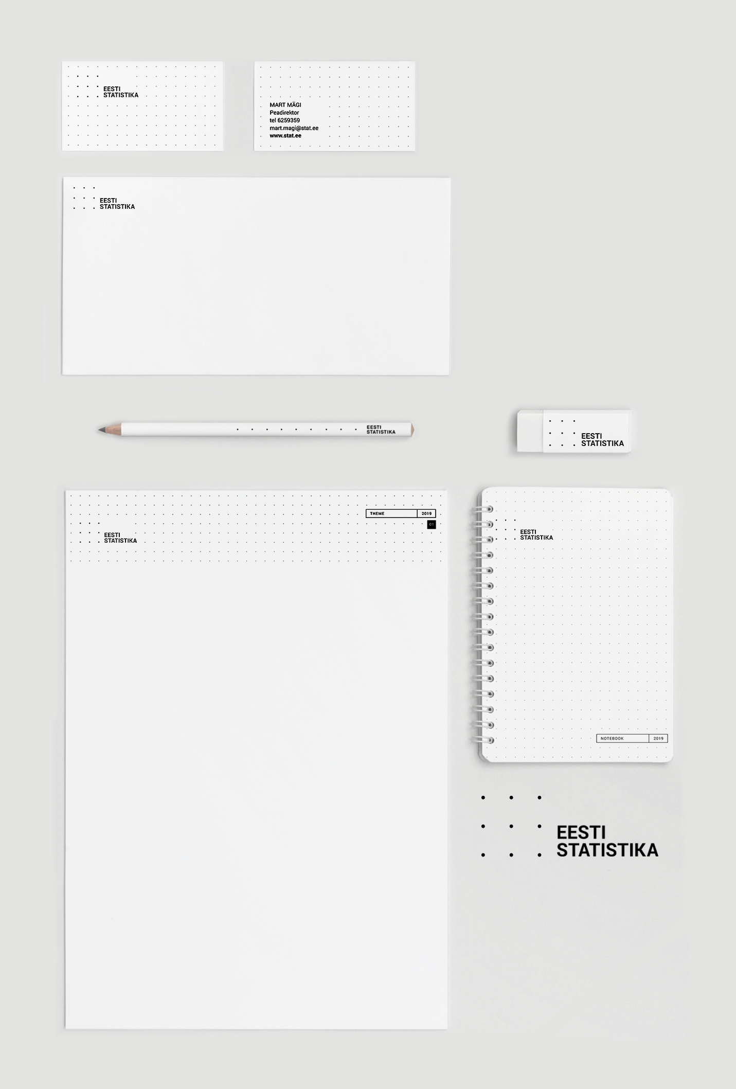
A4 document cover layout example
Presentation layout example
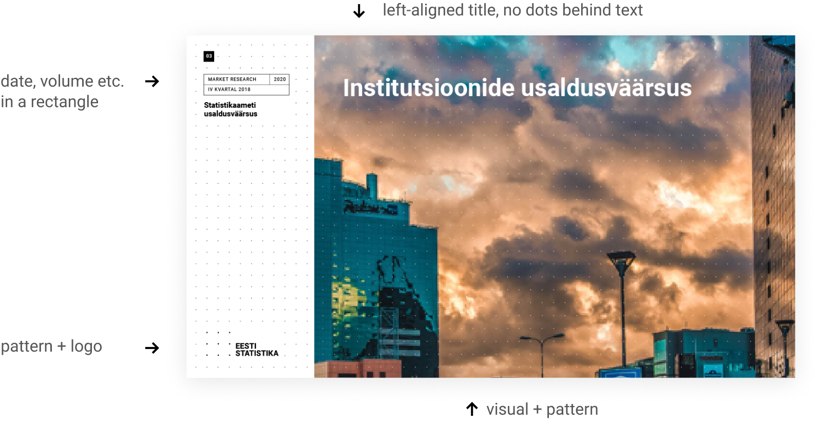
The pattern and logo are used as a branding element on the left edge, with room for titles and detailed information.
Extra information
Use a rectangle to add any extra information – date, volume, topic, theme. Page number is in a black square and single numbers start with zero, eg 03. Use uppercase text style inside the box.
