Colours
Colour is crucial in driving attention, organising information, highlighting emphasis and creating emotion. Colour is one of our tools.
The primary brand colours
The primary brand colors are black, white and a variety of grays. The monocromatic palette emphasizes the neutral nature of data. We keep these primary colours when we talk about us or data in general, in the following typography and background samples.
-
#000000 0/0/0/100titles, backgrounds, icons, buttons
-
#ffffff 0/0/0/0text, backgrounds
-
#565656 0/0/0/90body text
-
#dddddd 0/0/0/30lines, borders, disabled
-
#f8f8f8 0/0/0/5backgrounds
Extended colour palette
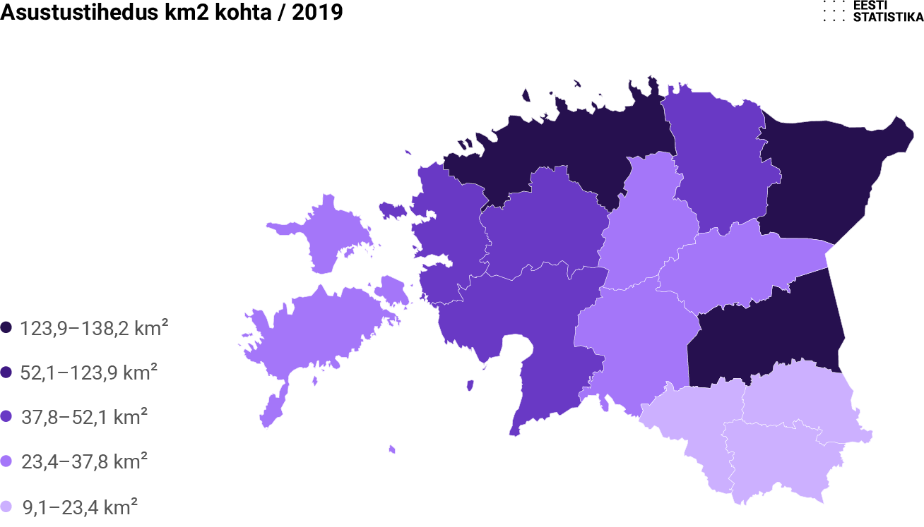
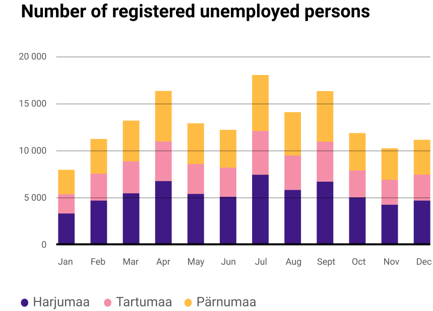
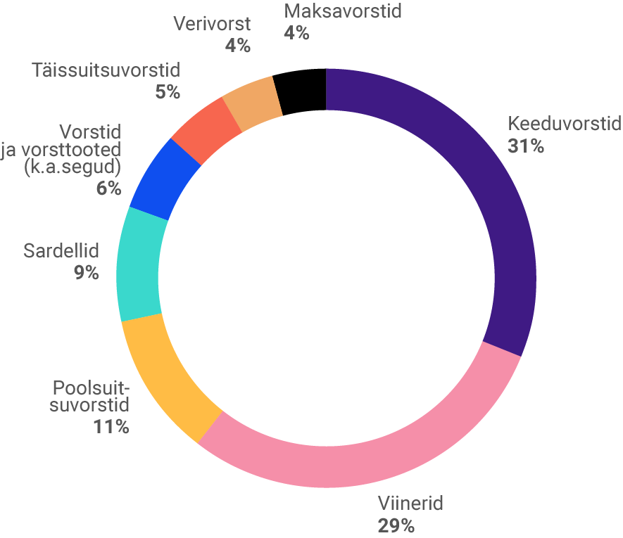
The extended colour palette is used in infographics, charts, and illustrations. The overall monochrome brand allows for the colour of data to stand out. To ensure consistency in the use of colour, the selected tones should be used in charts following the present order.
Use colours in this order:
-
#3f1a84 92/100/11/5
-
#f58fa9 0/55/13/0
-
#ffbc45 2/35/94/0
-
#3ad8cc 60/0/29/0
-
#0f4fef 84/69/0/0
-
#f7664f 0/75/70/0
-
#000000 0/0/0/100
-
#f0a764 4/39/68/0
-
#d4119b 16/95/0/0
-
#c7b8f5 21/27/0/0
-
#676d27 58/40/100/24
-
#fdc0b7 0/30/20/0
-
#037a75 87/33/54/11
-
#b4b1b5 30/26/23/0
-
#eed4a1 6/15/41/0
-
#43c7f6 59/0/0/0
-
#ad240f 22/97/100/15
-
#d8a31d 16/36/100/0
-
#162659 100/93/35/30
-
#f5f277 7/0/65/0
-
#9eb7d5 37/20/5/0
-
#ab75e7 44/58/0/0
-
#991a5e 37/100/38/12
-
#4dc14d 68/0/94/0
Examples:
Analogous color scheme
-
#301563 95/100/26/23
-
#3f1a84 92/100/11/5
-
#6939c5 72/82/0/0
-
#a476f9 48/57/0/0
-
#ccb0ff 22/31/0/0
-
#053e39 90/52/67/52
-
#0a8077 86/30/56/9
-
#3ad8cc 60/0/29/0
-
#6bf4ea 44/0/18/0
-
#a4fff8 29/0/10/0
-
#820525 29/100/81/35
-
#ba1e46 20/100/67/8
-
#e24a71 6/86/37/0
-
#f58fa9 0/55/13/0
-
#ffbfcf 0/31/4/0
-
#9d690d 32/56/100/17
-
#e09614 11/45/100/0
-
#ffbc45 0/29/83/0
-
#ffd07d 0/19/59/0
-
#ffe2ad 0/11/36/0
-
#061d55 100/94/34/36
-
#0e3cb0 96/85/0/0
-
#0f4fef 84/69/0/0
-
#648ff9 60/42/0/0
-
#c0d2ff 21/12/0/0
-
#761a0c 31/95/100/42
-
#c03620 18/92/100/7
-
#f7664f 0/75/70/0
-
#ff9281 0/53/42/0
-
#ffcbc2 0/24/16/0
Always use solid colours, avoid using gradients.

Example:


