Logo and usages
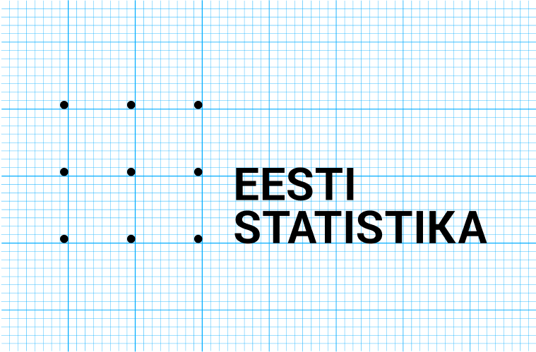
The logo is the Eesti Statistika wordmark, but it is always used paired with a symbol consisting of nine, regularly distributed data points. These nine data points are representing the data behind everything and are connected to the grid behind it.
The logo wordmark is always used together with the symbol.


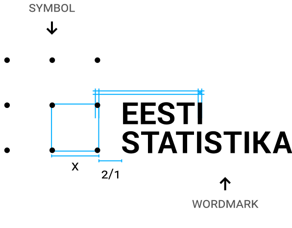
The minimum size of the dots is the width of letter “I”. The bottom of the lower dots are aligned with the bottom of the logo wordmark.
Logo usage
To make sure the logo is legible in all sizes, there are 3 versions of the logo – regular, square, and signature.

REGULAR
Minimum height: 30px
The regular logo is the preferred option for websites and most of the visual material produced.

Use only for square profile images.

Minimum height: 15px
Maximum height: 20px
The signature logo is used when the logo is meant to be very small, like a signature under charts.
Safe space and background
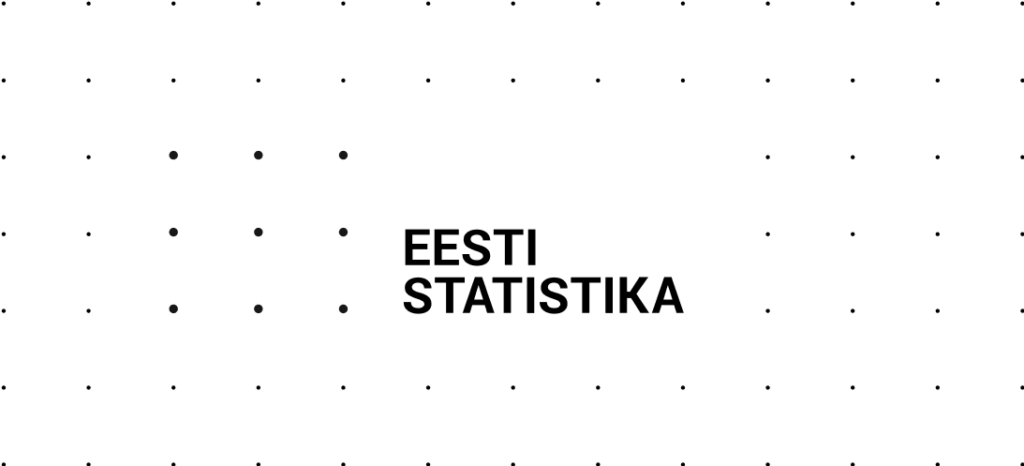
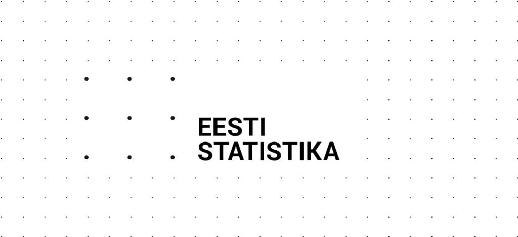
The logo is used on the pattern, simple or double-sized depending on the final format and the document. Try positioning the logo towards the left side of the design.

White space around the logo is half of the space between the 2 logo dots

Use white background behind the logo

Double-sized pattern